The Mouth: Smile Lines
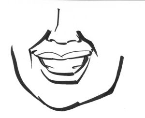
Don’t do this:
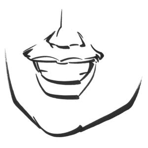
Do this:
If you lay in those smile lines so dark, you’re going to end up with a pretty weird-looking face. Just about everybody has these lines, from babies to seniors, but I find it best to add them during the coloring process, not here. It’s okay to draw smile lines right at the corners of the mouth, but if you connect them up to the sides of the nose, you’d better use a thin line and be careful. Getting these wrong is the best way to make a baby look like a withered old man.
The Mouth: Teeth
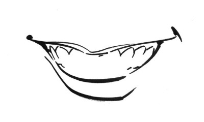
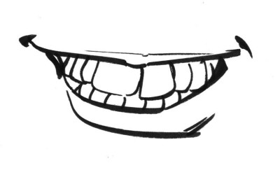
This right here is about the most detail I ever put in a mouth. It’s not a good idea to delineate every tooth, until you have a lot of experience.
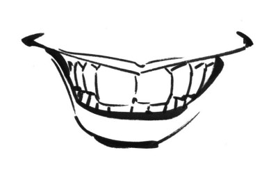
Here’s what happens when you draw each tooth:
And here’s what happens when you draw each tooth, badly:
This can be a matter of personal preference. I’ll add more detail if the subject’s teeth are interesting or unusual, like in the case of Obama or Chris Rock. But generally I want the focus to be on something else.
The Head:
Here’s a common beginner mistake: the head chop. New caricaturists often spend all their time on the features of the face, and treat the top of the head like an afterthought. Don’t do this:
Think about the skull. It’s still there, no matter what the hair looks like. Imagine the bald head underneath:
Then draw the hair as it would fit over and around the top of the head:
With just a little practice, this will add a lot of realism to your drawings of people.


appreciate the help